President Trump revealed the logo for the new military branch known as the Space Force and it looks strikingly similar to the Star Trek logo, according to Cabrini students interviewed.
What is the Space Force?
The Space Force is a new military branch of government that President Trump created to take over the Space Command, which was a major command within the U.S. Air Force. The Space Command’s responsibilities included the procurement and operation of military space technology such as spaceplanes, satellites and rockets. The Space Command was also in charge of programs like the Global Positioning System (GPS), the Defense Meteorological Satellite Program and the Space-Based Infrared System Program.

President Trump first proposed the Space Force in 2018 to take over the role of the Space Command because he believed that the United States military’s space technology needed more protection against foreign threats. According to Forbes, “The Trump administration proposed that this new military branch – the ‘Space Force’ – sit within the Air Force, just as the Marine Corps sits within the Navy.”
As of December 20, 2019, the Space Force officially became the sixth military branch of the United States military. The United States is the only country in the whole world to have a Space Force.
Logo Similarities
President Trump posted on Twitter Friday, Jan. 24, what the logo for the Space Force was going to look like.
“After consultation with our Great Military Leaders, designers, and others, I am pleased to present the new logo for the United States Space Force, the Sixth Branch of our Magnificent Military,” President Trump wrote in his Twitter post.
Many people were quick to comment on the logo, comparing the logo to look highly similar to the Star Trek logo. One of the biggest critics about the similarities between the two logos is George Takei, who played the character Hikaru Sulu in the original Star Trek series in the 1960s. Takei reposted President Trump’s post about the Space Force logo with the caption, “Ahem. We are expecting some royalties from this…”

Both the Space Force and Star Trek logos are dark blue circles with giant arrow-like shapes in the center with a star swooshing in front of them, while surrounded by tinier decorative stars. The main differences between these two emblems are the colors. The Space force logo being dark blue and silver, while the Star Trek logo is yellow, blue and red. Also, the Space Force logo reads “United States Space Force, Department of the Air Force,” while the Star Trek logo reads “Starfleet Command, United Federation of Planets.”
However, many people were quick to defend the Space Force emblem by saying that it was actually inspired by the Air Force seal. John Noonan, a conservative national security commentator and analyst, tweeted a side-by-side comparison of the Air Force seal and the Space Force logo with the caption, “For those excitedly tweeting that Trump stole the Star Trek logo!!!!, the patch on the left was the existing Air Force Command logo. The same one I wore as a Lieutenant in 2005.”
According to Space, Space Force officials came out with a statement about the meaning behind the design of the logo. “The creation of the U.S. Space Force seal pays tribute to the newest Armed Service that organizes, trains, and equips space forces in order to protect U.S. and allied interests in space and to provide space capabilities to the joint force,” Space Force officials wrote in a Facebook post on Friday, Jan. 24.
Star Trek logo designer Michael Okuda, who was hired by NASA and created multiple logos for missions and programs, took to social media to respond to the design of the Space Force logo.
“Well, they say that imitation is the sincerest form of flattery!” Okuda wrote.
Students’ Thoughts
Since the Space Force is so new to the United States, the majority of students didn’t know what exactly the Space Force was or even heard of it. However, there were a handful of students who knew what the Space Force was about.
“I believe [the Space Force is] a military plan that Donald Trump put through basically,” Jared Delisa, senior international business major, said when asked if he knew what the Space Force was.
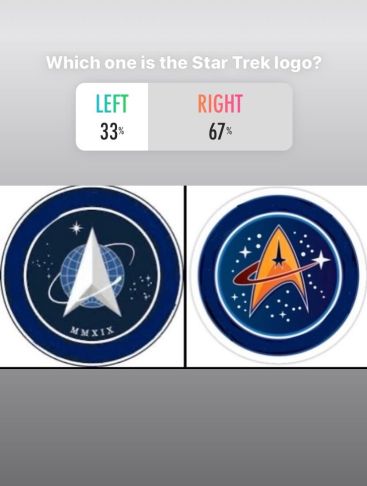
Along with being asked if they knew what the Space Force was, students were also asked to identify which logo they believed was the Star Trek logo when shown a picture of the two logos side by side. Many students were able to guess correctly, but some students did manage to mix up the two logos.

Students gave their thoughts and opinions about the similarities between the Space Force and Star Trek logos.
“[President Trump] never had any originality to me…They’re very much similar,” Asha Jackson, senior human resource management, said.
Many students would agree with Jackson’s opinion about the Space Force and Star Trek logos appearing to look very similar.
“It’s very, very similar,” Nicole Bydalek, sophomore early childhood education major, said in reference to the Space Force logo. “The only difference is that the world is around the arrow, but very similar.”
Nine out of 10 students were able to differentiate the Space Force logo from the Star Trek logo, but the polling didn’t stop there.
Does Color Make a Difference?
The Space Force logo and the Star Trek logo was shown in color to students, which might have made it easier for them to differentiate the two logos.
“Cause [the Star Trek logo] looks a little cartoon-ish,” Dominic Ervin, junior early childhood and special education major, said in regards to the design of the Star Trek logo in color.
Two polls were conducted on Instagram, asking people to identify which logo was the Star Trek logo. One poll displayed the two logos in color, while the other was in black and white.
The first poll, which was in color, ended with a final result of 40 percent answering incorrectly, while 60 percent of the final results showed people answering correctly.
The second poll, which was in black and white, ended with a final result of 41 percent answering incorrectly, while 59 percent of the final results showed people answering correctly.
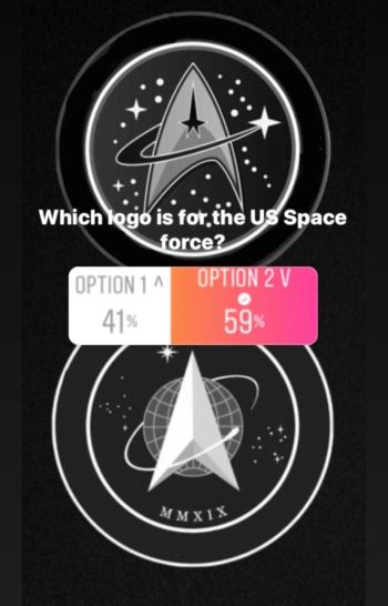
Overall, it has been shown that whether shown in color or black and white, people can still differentiate between the Space Force logo and the Star Trek logo but showing the logos in black and white makes it slightly harder for people to identify the difference.
In the end, the people have spoken. The Space Force logo is too similar to the Star Trek logo.